Has the Spanish curve peaked? – 29-Mar-2020
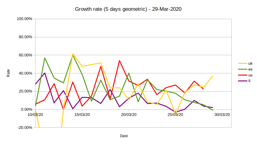
Good signs from the Spanish curve! Even if the daily death toll is still very high, in the 600-800 range, there are strong indications that the curve has peaked, as seen in the figure below (green line): the five-day’s geometric average of the growth rate of deaths is now negative (-1%) with the doubling time gone to infinity.
From the comparison between the four countries monitored, one can also see a similar trend developing in Italy (purple), with the US (red) and UK (orange) curves moving instead together in the opposite direction.
It is interesting to note how these numbers are wrongly reported by the media here: the main focus is on the high death rates in Italy and Spain, but with little attention to the evidence that the measures taken in these countries are succeeding in controlling and slowing the infection.
Recent Comments