Fitting the Italian’s curve
Has the Italian’s fatalities growth rate finally peaked? The model described in this post and the plot below seem to suggest so.
The peak appears to be on the 31st of March, with a maximum number of daily fatalities of around 845 and a goodness of fit (R^2) of 0.94. As described before, one can estimate the final death toll by integrating the area under the curve. This number totals to approximately 24000 deaths in this period alone, without considering possible second or third waves in the winters to come.
This figure is relatively similar to what seen for the UK, even if with some time delay in following the curve in the British case.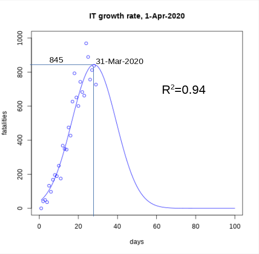
Recent Comments