What’s happening to the UK’s curve?
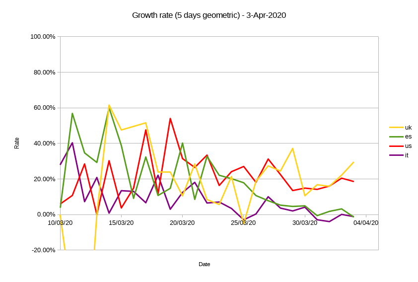
Worrying numbers in the last three days for the UK’s curves, resulting in a decreasing doubling time and increasing growth rate of fatalities. The five days geometrically averaged growth rate is now close to 30% daily and the corresponding doubling time has tumbled to 2.7 days.
Let’s looks at the evolution of these indicators in the two figures below.
First of all there is a confirmed similarity between the UK and US curves on one side and the Italian and Spanish ones on the other. IT and ES have clearly peaked and are now in negative rates domain and their doubling time is going off-scale (a good thing). The latest figures from the UK show instead a dramatically high daily growth rate. This is really worrying when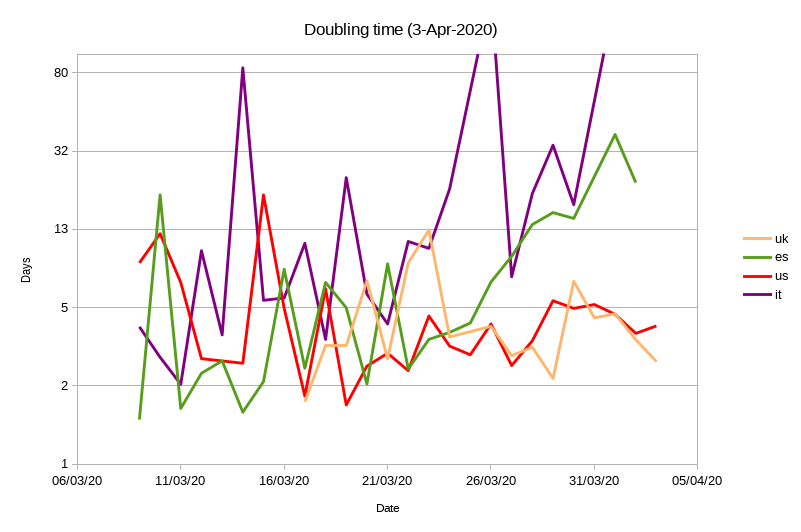 forecasting the total number of deaths. In a previous post I estimated a total death toll in the range of 5,000-20,000 in the best-to-worst scenarios. With the latest numbers, the worst scenario is now above 50,000. Can this be real?
Recent news seem to attribute this anomaly to the delay between an effective death and the time when this is officially reported and aggregated in the statistics. If this is the case, when the UK curve looked very low two weeks ago, it was in fact much higher, and the recent high number of deaths might indicate that those deaths are now finally tallied.
If this interpretation is correct, it is possible that the UK infection curve has followed closely the Italian one all along, and that the total number of deaths will be in the 25,000 range at the end.
Recent Comments